Bright, Bold, Colorful and Creative Interiors
- Jan 18, 2019
- 6 min read
Ariel G
~
Instagram: @pmqfortwo | pmqfortwo.com
Once you walk through the front door, you’re in the living room! This small house had an entryway that was three-feet deep, so you were very quickly in the living room. Because of that, we only had one wall to use, so we hacked an Ikea unit to look like built-ins.
Our dining room used to be a bedroom, so the footprint is small. We just had room for a table and a sideboard (barely!). I made the space feel bigger with the blue on the walls (Rainy Season by Behr), and by positioning the mid-century modern furniture (thrifted treasures) along the length of the room. Because you can see almost the entirety of the space when you walk through the front door, I made sure you could see all the good stuff first.

What’s Your Story?
I’m a Canadian home decor and DIY blogger who creates bright, bold, colorful and creative interiors and DIYs. As a city girl currently living near more forests than Starbucks, I make my style work by thrifting and creating the colorful and eclectic pieces I need. My renter-friendly take on design and decor is fun and colorful, and makes perfect sense for the young and urban households.
Biggest Home Challenge
The biggest challenge we have faced has been space and permanence. As a military family, we move quite a lot and are often in base housing, where there’s a long list of things you can’t do (but I do them anyways). This home (in base housing) had quite a few limitations, which meant I moved my blogging operations to a studio space in order to create the space I needed to express myself (both at work AND at home). Because my blog is a mix of my home, craft and idealized situations, I need the space and natural light to create my vignettes for work, all the while still having a colorful place to call home that felt like us.
Proudest DIY Moment
My proudest DIY moment was painting some illusion trim work on the walls in our last base rental. It was then the basis of my first big online feature (with Martha Stewart). We couldn’t add framing and trim to the walls, so I created it through the illusion of paint and tape. To be honest, though, every space or project that I complete has me saying, “Wow, I think this is my fave.” I learn so much from each process, so each new project brings the successes and failures of the last one forward. In terms of tips: practice makes perfect, but don’t be afraid to let go of the planning and just “feel it out.” There’s more fun in a story, and you’ll appreciate the journey more that way.
For our tiny kitchen, we used removable wallpaper from Spoonflower to create a standout wall. The pseudo backsplash with a busy pattern is a great way to bring some life and color to an otherwise boring situation. When you’re in a rental, you can’t exactly rip out the cupboards, so we did the best with what we had.
The upstairs powder room was literally the size of a closet. The footprint was enough for a toilet and a sink with some cupboards. Because the walls are slanted, I wanted to create the illusion of height. I did so with black wallpaper stripes placed vertically.
Eclectic Design
I love the idea of eclectic design because it means whatever you want it to. It’s a catch-all for making the pieces you love work together. Mixing and matching periods and styles truly intrigues me. It’s such a fun way to create interest and add depth to design, which can sometimes seem a little flat— and it really tells a story about your taste and interests through styling and design choices. Creating harmony between your choices is where all the fun lies! Especially because I use colors and patterns to create the balance and unify sometimes disparate elements.
Shopping Secrets
Always ask to see the “other stuff.” Thrift stores and antique stores have always got a back room (often unpriced stuff waiting to be sorted) or there’s a sale section for things that just never sold. If you make friends with the independent store owners, it’s easier to develop a relationship that leads to great finds. Also, don’t be afraid to look past an item’s current state. You can almost always fix something.
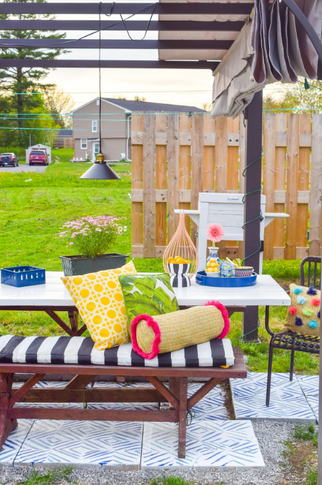
«For our tiny kitchen, we used removable wallpaper from Spoonflower to create a standout wall. The pseudo backsplash with a busy pattern is a great way to bring some life and color to an otherwise boring situation. When you’re in a rental, you can’t exactly rip out the cupboards, so we did the best with what we had. The upstairs powder room was literally the size of a closet. The footprint was enough for a toilet and a sink with some cupboards. Because the walls are slanted, I wanted to create the illusion of height. I did so with black wallpaper stripes placed vertically. When it came to the patio, we relied on the power of DIY and paint to create little moments of colors and peace. We built these loungers from scratch, used outdoor paint instead of stain (Lady Guinevere by Behr) and accented with bright textiles from Homesense.
Don’t Half-Ass Anything
My style is colorful, eclectic, curated and bold. I don’t half-ass anything, especially not my color choices. Once you become familiar with my style, it’s unmistakable: the mix of patterns, the mixand-match approach to styles and textures.
Our master bedroom was our own personal oasis. We chose blue because the rest of the house already had such dominant colors, so we mirrored the blue from the dining room (Rainy Season by Behr). By adding a black painted faux trim along the edges of the walls, we created a visual interest without traditional casins or trim (not an option when you’re a renter). Since the space itself was so small, we couldn’t fit more than the essentials, and it forced us into a less than ideal floor plan with the bed against the window, but with blinds and curtains, it worked! The funky Midwestern rug from Rugs USA really added a warm balance to all the blue. The bone inlay dresser is another DIY using a stencil.
Finding Balance as an Entrepreneur
This is something I’m still working on, and it is something my husband says I’m terrible at. I’m still in the “take every contract, turn down nothing” portion of growth and expansion as a small business, so I pull a lot of late nights and early mornings. I miss a lot of social events for work, and I plan my appointments around daylight hours for photography. I’m self-employed, so it’s the nature of the beast. That being said, when I can, I try to implement things like “no phone Friday nights,” and when I’m socializing with friends I make a conscious effort to put my phone away. It means that I’m not worrying about work, checking notifications or aimlessly scrolling. I’m going to be working long days for the next little while still, so I might as well fully immerse myself in the moments when I’m NOT working.
Something We Might Not Know About Your Field
It’s actually a LOT of work. I like to say that I have the pleasure of working for myself 24 hours a day and 10 days a week, and I mean it! The job never ends, and that’s kind of fun, but also the curse. Staying engaged online, creating beautiful content, working through kinks, negotiating contracts and finding partnerships that fit—it all takes time, and there are only so many hours in a day
The studio space is a converted classroom in a repurposed school. We created a kitchen nook and a work space (among many other practical and technical spaces) to allow me to continue working as a blogger and content creator (despite the limitations of our small base rental). Once again, the power of paint and lots of bright accessories transformed the space. Everything from knick knacks, carpets, pillows and more!
Top Tips For Healthy/Productive Workflow
That’s a hard one, because I don’t always have one! My workflow is very seasonal, so it’s all about prepping for the busy seasons and staying busy in the slow ones. The best tip I’ve ever received in terms of productivity is to make the most out of the time allotted to each task by being fully present for it. For example: You’re answering emails? Great. That’s all you’re doing for the next 20 minutes.


Comments